TUESDAY, OCTOBER 16, 2012
Tessin Palace Tour
 |
| It's hard to appreciate the intricacy of the planting patterns in the courtyard garden when you're in the garden itself. Seen from above, the patterns pop out and amaze. |
A few months ago, I toured the Tessin Palace with my friend
Alison, another American architect living in Stockholm. The Tessin Palace was one of the “Palaces of
the 1600’s” that I researched and wrote about in this post.
Originally designed by and lived in
by Nicodemus Tessin the Younger, one of the most important and prominent
architects in Sweden’s history, the palace is now used by the “governor” of
Stockholm County/Province (not sure what the exact translation would be for how
the country of Sweden is divided up into geographic administrative areas). Since it is a private residence, the palace
is not usually open to the public, but the doors are opened twice a year, once
in the spring and once in the fall.
During my “Palaces of the 1600’s” research I learned about the tours the
day after the spring tour. I was so
bummed to have missed it! But I put the
fall tour in my calendar and carefully guarded that day so that I would finally
be able to see the palace interior and gardens.
And I’m so glad that I did!
The plan of the building is quite complex, something that
you would never realize by looking at the façade.
 |
| The facade today. People stand in line for an hour or more to get on one of the tours. |
Originally, the front entrance was flanked by
wing walls (1), but these were removed at some point during the last 300 years. According to a drawing from the early 1700’s,
the wing walls appear to be perpendicular to the front façade, but they form an
angled yard (2) in Tessin’s plan drawing.
 |
| The facade at the beginning of the 1700's. |
The main residence and head building (3) is actually fairy small with a central
hall leading directly to the garden. The
hall is flanked by four comfortably sized but moderate rooms on the ground
floor. On the two private living floors
above, there is no central hall granting access to the rooms; instead, one room
leads directly into another as was common in palaces at the time. In the courtyard, an elaborately curving
baroque garden (4) dominates the space.
There are a grotto (5) (now empty) and a large but secondary garden (6)
behind the space-separating walls.
Wings (7) on either side of the garden are only one room
wide and only have openings facing into the courtyard. The right-hand wing is alongside an alleyway,
but this façade is completely closed with a blank plaster wall. I am not sure what these wings were used for
but I can imagine they were guest rooms or servants’ quarters. The entire back portion (8) of the palace was
not on the tour, either, and I do not really know what was housed back there. Likely the kitchens and servants’ areas were
back here, although the plan of the ground floor includes a large room with
large openings that potentially might have been an off-the-garden entertaining
space.

On the third floor above this behind-the-garden building is
an open-air temple. Although this temple
appears to be very deep, maybe 50 feet deep, it is actually only about 7 or 10
feet deep. Tessin accomplished this
illusion through the use of forced perspective; your eye thinks that the two
rows of columns are parallel because in your experience, colonnades are always
parallel. However, these two rows of
columns are angled with them being closer together toward the back, so your eye
is tricked into thinking that the space is much deeper than it actually is.
 |
| The temple is perched up above the garden. |
The gardens were even more amazing than expected. In person, you get a much better sense of scale. Playing with perspective, as he did with the
garden temple, was one of Tessin’s overarching themes when designing the palace
and gardens. Tessin designed so much
into the garden that it looks huge in photos, but it is actually quite intimate
despite being divided into several individual areas and containing various
follies and places to pause and rest.
While the scale of the garden feels rather intimate, the atmosphere
feels richly grandiose with the flowing, curving baroque plantings, spouting fountains, embracing garden walls, a seemingly
huge garden temple, niches, overflowing classical ornamentation, and the varied
masses of the building and wings. This
richness is in stark contrast to the simple palace façade which reveals nothing
of the baroque exuberance to be found only a couple of rooms past the front
door.
 |
| The main house from behind the curving garden walls; a nice in a quite corner of the garden; the differently sized and detailed masses surrounding the gardens. |
The third floor of the main building remains the same as when
Tessin lived here in the late 1600’s and early 1700’s. Like the gardens, the richness of the
interior decoration juxtaposes with the simple façade to create a rich
surprise. Every surface is richly treated:
the gleaming wooden floors have intricate parquet patterns, the walls are
painted with each room having its own theme, the ceilings are shaped and
painted to continue the wall themes, every fireplace mantle is exquisitely
carved, the doors have intricate inlays…
I don’t have a distinct memory of the various themes that were covered
by the wall paintings, but they were all generally classical and many scenes
portrayed the arts in various manners.

Like the garden, Tessin played with perspective in his
living quarters. As I mentioned, the
rooms are not accessed by a hallway but lead from one to the next. Each door frame is lined up in a straight
row. Like the temple’s forced perspective,
Tessin played with the door sizes to create another forced perspective that
makes the rooms appear larger than they actually are. From experience, you are used to each door in
a house being the same size. However, in
Tessin’s house, the doors get smaller the farther away they are from the
central room; this makes it seem like the farthest doorway is much, much
farther away than it is in reality.

Due to camera battery issues, I didn’t get a ton of photos,
but I got enough to give a clue to the essence of the palace. I can’t wait to go back in the spring and
take more photos and learn more about the gardens and wall paintings! It was such a treat to tour the palace, and it
was a rare opportunity to see what an architect would design without having to
cater to a client.
Plan and interior door images from http://www.lansstyrelsen.se/stockholm/SiteCollectionDocuments/Sv/publikationer/2012/tessinska-palatset-2.tr-2012.pdf
Drawing of Tessin Palace from Stormaktstidens privatpalats i
Stockholm by Martin Arvid
Ohlsson (1951)
FRIDAY, AUGUST 10, 2012
Kiruna's Church
 |
| Sadly, a concrete drive has been paved all the way around the church, but from a distance and seen through the birch trees, the church looks as it should. |
When Carl and I flew into Kiruna for our Lappland hiking
adventure, we had a couple of hours to kill before our bus departed. We spent most of our time admiring the town’s
church. In 1901, the mining company
(Kiruna is only exists due to iron ore mining) commissioned Gustaf Wickman to design a permanent church to
replace the community’s temporary church.
Wickman collaborated with sculptor Christian Eriksson, and the result is
beautiful.
 |
| The belltower was my favorite part. |
The church has no
single inspiration; instead, it is an amalgamation of several simultaneous
architectural ideas of the time. It is
central in plan like so many of Sweden’s
modern Lutheran churches, although it is focused toward a front alter. The central plan coupled with the visible
timber trusses are said to recall the Sami (local indigenous people) teepees,
and the all-timber construction techniques recall Sweden’s traditional
buildings. Additionally, the church is
painted the typical Swedish red, and gold finials recall Viking buildings and
ships. For these reasons, the church is
a good example in wood of the Swedish National Romantic movement. Fish-scale wood shakes cover the entire
façade and roof, lending the building a late-Victorian Queen Anne air. The roofs extend all the way to the ground,
much like contemporaneous Greene & Greene and McKinley, Mead, & White
houses in the United States. The expressed flying buttresses add a Gothic
Revival flair, and the medieval-looking handmade doors as well as all the
intricate woodwork are associated with the Arts and Crafts movement. The bell tower even has an onion dome.

The abundance of
high, clear windows on the facades of the four gables let quite a lot of light
stream into the church, relieving the dark, woody, somber mood. Although traditional timber and beam
construction was used, the architect artfully incorporated modern materials
like steel bands and braces that bundle columns of several timbers together.

While it can be
said that the church is an amalgamation of many influences, to me, it stands uniquely
alone. Wickman was able to meld a wide
variety of influences into a rich composition that both respects Swedish
tradition and modernizes it.
In
an interesting side note, the entire town of Kiruna, including this
church, will soon be physically moved. Over time, the mine is causing
the ground around it to become more and more unstable. As areas become
unsafe, they will be moved farther away from the mine. The mining
company and the Swedish government are collaborating to pay for this
crazy expense. Because the church is fairly far from the mine, it is
expected to remain in place for twenty or so years before it must be
moved.
WEDNESDAY, JUNE 20, 2012
Ulriksdals Slott

Carl and I spent Sweden’s National Day (June 6th)
strolling the grounds of Ulriksdals Slott which sits on a lake just outside of Stockholm's city center. It was a lovely, relaxing day of sunshine and
lilac scent wafting over the grounds.

This palace and pleasure ground lies just outside of Stockholm. It was originally designed by the French
architect Hans Jacob Kristler for Jacob De la Gardie and was
completed in 1645. Jacob de la Gardie was a
psudo-royal as his mother was the illegitimate daughter of King Johan III. He became the Commander of the Swedish Army
and fought against the Russians and the Polish-Lithuanian Commonwealth. He was also one of the five regents that
jointly governed Sweden
until Queen Kristina became old enough to rule herself. So while de la Gardie
was not official royalty, he was the next best thing, and the large and
sumptuous palace that he built for himself eagerly proclaims his nearly-royal
status. Not only was the exterior
impressive, but the interior was wallpapered with gilded leather and french
silk, and all of the furniture was gilt.
 |
| this drawing from the 1600's shows the palace in its original form |
Like
just about every other palace in Stockholm
from this period, Ulriksdals Slott has been renovated several times to fit the
passing stylistic fads, and it now retains nothing of its original
appearance. The palace was renovated by
three of Stockholm’s
most important architects. Jean de la
Vallée was the first to alter the palace.
It seems that he didn’t change the appearance of the palace but merely
connected the projecting (servant) wings to the main residence in the
middle. Next, after the palace had been
bought by the Dowager Queen Hedvig Eleonora (the palace remains in the
possession of the Royal Family today), Nicholas Tessin the Elder added a
third floor to the wings. In the 1720’s,
Carl Hårleman altered the facades by lowering the roofs to be in accordance with
the popular French mansard roofs and by stripping the facades of their pilasters
and all their Dutch Baroque flamboyance at the roofline. In comparison to the original detailing, the
palace’s current look is restrained, classical, and simple.
 |
| On the left is the 1739 painting by David von Cöln and on the right is Johan Sevenbom's work from the 1700's. From the depiction of the gardens, it appears that Cöln's painting is older as it does not depict the allée (see below). |
Uriksdals
slot is expecially interesting to me because not only are the building
renovations over time well documented, but the garden renovations are
also well documented both in written and painted descriptions. The
original Renaissance garden by Hans Georg Kraus consisted of a grotto, a bosque, and a
maze. While Jean de la Vallée was
renovating the palace, he also renovated the grounds. According to his French sensibilities, he
created a formal, mostly-symmetrical parterre garden complete with box hedges to
separate the garden beds, newly-dug ponds, sculptures, and fountains. The Orangerie was re-built during Nicholas
Tessin the Elder’s time renovating the palace.
 |
| This drawing from the late 1600's shows Jean de la Vallée's formal garden (note that the house has not yet been "modernized" in this drawing). To the right is Tessin the Elder's slightly later orangerie. |
The
gardens were again altered in the 1720’s when Carl Hårleman was renovating the
palace. At this time, strictly
symmetrical Baroque gardens were immensely popular, so Hårleman attempted to
regularize the gardens. The southern
boundary of the formal garden is a stream, and unfortunately for Baroque
gardeners, this stream does not angle to accommodate the garden's forced perspective. To solve this problem, Hårleman effectively cut out
the southern wedge from the formal garden.
The now disconnected space became an allée and two new hidden
gardens. Hårleman used a tall hedge to disconnect and hide the allée and hidden gardens from the main garden. Probably not incidentally, these tall hedges
create secluded, sheltered spots just perfect for courtly flirtation and
intrigue.
 |
| the "new" formal gardens remain today |
 |
| The allée and a Hårleman's plan to re-design the formal gardens. You can see the wedge on the left side of the garden (to the right of the stream) that was "removed" from sight by means of tall hedges. The allée lies between the "removed" section of garden and the stream. |
By
the 1800’s, the popularity of the strict symmetry of the Baroque garden had
given way to the winding, “natural” English Romantic garden. It seems that the formal gardens were left
more or less intact, but a romantic English garden was planted beyond the
formal parterre garden. Winding lanes
took advantage of the naturally rolling landscape, and this landscape was
further enhanced by new ponds and 2000 new trees.
Several follies were introduced as destinations in the landscape such as
this Turkish Pavillion.
 |
| views from inside the Turkish Pavilion |
I
have found no written evidence to this effect, but by the 1930’s when the
royalty was no longer receiving much income from the Swedish government, I can
only imagine that the extensive formal and English gardens were simply too
expensive and intensive to maintain, especially considering that Ulriksdal was
only one of the ten or fifteen palaces still owned and maintained by the
monarchy. The official palace website
makes no mention of financial difficulties but instead merely states that in
1935 Gösta Reuterswärd
was hired to update the gardens according to the ideals of Modern
Classicism. At this time, the Baroque
formal gardens were dug under and many of the Romantic ponds were filled
in. Now, the main garden consists of
four simple but expansive lawns crossed by two axes: one emanating from the castle’s central
building, and the other from the middle of the orangerie. A simple, square pool with a simple fountain
now occupies the crossing of the two axes.
 |
| the palace from today's central axis and the simple square pool with simple fountain |
Another
indication of financial constraints is that during the 1800’s, when the royal
court was no longer housed at Ulriksdals Slott, the crown began leasing the
surrounding land and buildings to businesses and individuals. During this period, private Stockholm residents leased land in the area
and built their own impressive summer homes on it. Today, now that the area is now well-connected
to central Stockholm,
these houses are year-round residences.
 |
| one of the private summer houses on the palace estate |
After
300 years and many succeeding generations of Sweden’s kings and queens, the
palace remains in possession of the Royal Family. While the palace and grounds were actively
used by the royal families, they were regularly “modernized.” Today, the palace doesn’t seem to be
currently used by any royalty. Instead,
a wing of the palace is used by WWF as an office, and the rest of the palace is
preserved as a museum and can be visited during the summer months.
And
just for fun:
 |
| these concrete chairs were impressively comfortable |
 |
| I fell in love with this orchard on the estate |
THURSDAY, DECEMBER 01, 2011
Deep Thoughts during an Organ Concert

Less than 3% of Swedes are regular attendees of Church of Sweden services. Yet there are at least 2030 churches in a
country of 10 million people. Pretending
that each church gets an equal number of regular attendees, only 30 people
would attend each church every week (this is of course not a real statistic
considering that churches in downtown Stockholm probably have a larger audience
than a rural church in Lapland, and considering that the 10 million people in
Sweden includes a good percentage of Muslims, Jews, Methodists, and such). The majority of these churches are
historically and architecturally significant buildings. If the Church of Sweden
were not receiving tax money to help with the upkeep of these buildings, most
of them would fall into disrepair. This
would be a sad loss to the art and architecture world.
Gladly,
most of Sweden’s 2030 churches are in fairly
good shape. Yet with such a low
attendance rate, it still begs the question of how to utilize these
spaces. Many churches in central Stockholm are trying to answer this
question
with music concerts. Some churches host
weekly lunchtime concerts. Some host
weekly evening concerts. These weekly
concerts tend to be just one or two musicians performing, but some
churches
host monthly concerts with larger ensembles.
Generally, these performances are free, but donations are always
accepted.
I have now attended two of these free concerts. The first was a lunchtime solo piano concert
in Clara Kyrka, and the second was a piano and organ concert last Friday
evening at St. Jacob’s Kyrka. Feeling
the powerful organ reverberate through my pew was such a potent experience that
it gave me periodic bouts of shiver bumps.
The music was so beautiful, a whole new definition of soaring, that it
made you want to believe in a god.
The church was the very definition of a “live” space. Each note bounced off the hard stone walls so
many times that the nave became a profusion of sound. The notes lingered audibly in the space for
so long that the pianist didn’t need the sustain pedal. All notes were sustained through
re-reverberation for several seconds.
You’d think that this would cause a cacophony of sound; instead, the
lingering notes became a supple background against which the lilting melody
contrasted.
Listening to this concert, I started to wonder how
architecture and music may have co-evolved.
A Romanesque church, with its smooth, rounded vaults, would have
produced a different sound than a Gothic church with its cornucopia of detail
and its pointed arches. As Gothic
churches developed, they were built more and more out of glass and less and
less of stone—I’m sure that music bounces off glass at a different rate than
off stone. And then when churches moved
into Renaissance styles with rounded vaults and more austere and restrained
surfaces, music must have sounded differently again. Further, the rounded forms of the Renaissance
must have produced different reverberation patterns than the ovoid forms of the
Baroque.
Over time, did composers consciously tweak their music to
work better with the changing spaces?
Were the master masons aware of how their buildings would affect the
sounds of music? Or were the resulting
differences in sound merely a matter of happenstance?
On another tangent, I realized during this concert that I am
the musical equivalent of someone who doesn’t like modern architecture. Several of the pieces were modern, and
several of the pieces were oldies but goodies like Bach and Vivaldi. I am just not a fan of most modern classical
music. I do not like jarring
sounds. I do not like atonal music. I do not appreciate off-key chords. I do not like music that has no trajectory
(this is probably why I’m not such a big fan of improvisational jazz, either). I much prefer classical music that has an
obvious melody with an obvious trajectory.
I love minor chords, but off-key chords and jarring sounds just grate on
my nerves. I know that this is the
musical equivalent of someone saying that they don’t like all that cold-feeling
modern steel and glass, that they just want the buildings to be pretty. To my ear, jarring noises and off-key chords
are a lazy way to express anguish or crisis or depression. The oldie-but-goodie composers managed to
express these same feelings with minor keys and by mediating the tempo of the
music. Brahms and Bach were able to
express strong emotions while still carrying a melody and without resorting to
the trick of banging pots and pans to get the listeners attention.
Anyway…
Unfortunately, attendance of these free and wonderful music
concerts doesn’t seem to be much greater than attendance at Sunday worship
services. There were fewer than 40
people at each concert. I do hope this
doesn’t deter the churches from continuing the concerts, because I am really
enjoying attending them when I can.
There’s nothing like an echoing 400-year-old church and a thundering organ
that’s older than my country to make me consider such existential thoughts!
SATURDAY, NOVEMBER 26, 2011
Turner, Monet, Twombly
 |
| Twombly's Hero and Leandro series. My favorite painting in the exhibit, I think. |
Last weekend Carl and I went to see the current exhibit at
the Moderna Museet, Turner, Money,
Twombly: Later Paintings. It was
wonderful! For the past several years,
Twombly has been my favorite painter, ever since my first visit to the Cy
Twombly Gallery at the Menil Collection in Houston, Texas. Everyone loves a good Monet, and Turner has
some beautiful work, too, making this exhibit a huge event in town.
Before this exhibit, I had always associated Turner with
paintings of sinking ships in turbulent seas.
Or sinking ships amidst a battle.
But his later paintings are different.
Instead of telling a story, they provoke a mood. They are not figural at all, instead, they
are very moody and brooding.
 |
| Turner's St Benedetto, Looking towards Fusina is one of the more figural paintings in the exhibition, but it is a good example of his color palate |
Apparently Monet admired Turner, and Twombly admired them
both, and with the exhibit’s side by side comparison method, you could really
see how Monet painted with a more modern version of Turner’s vision, and
Twombly painted with an even more modern version of both Monet and Turners’
visions. Monet even painted some of the
same London scenes
that Turner had painted 50 years before, and it was fascinating to see how he
painted the same thing so differently while using a similar vocabulary of light
and mist and mood.
 |
| Sunset scenes from the three artists |
It was especially interesting to see how the color palates
changed from artist to artist. Turner
used a lot of earth tones, and Monet used a lot of pastel colors. Twombly used (sad to use the past tense,
Twombly died this year) bright, primary colors.
His 2010 Camino Real II even
has a fluorescent color palate.
 |
| Twombly's, Camino Real (II) with fluorescent colors |
Of the three, Twombly still remains my favorite after seeing
this exhibit. His paintings are the
least figural of the three, but there is an urgency to his paintings that
captures my imagination. I love his bold
colors—while bold, they are rarely garish.
And being passionate about books myself, I love how many of Twombly’s
paintings incorporate poetry and word imagery.
The paintings were gathered from museums and private
collections all over the world. Interestingly,
there were no contributions from the Cy Twombly Gallery in Houston.
Twombly’s pond paintings in that gallery would have been a perfect
counterpoint to Monet and Turner’s water scenes. I’m curious about how the art lending and
exhibit creating world works. It must be
a mountain of legal paperwork and insurance policies!
 |
| with its bright colors and unusual level of abstraction, Monet's Japanese Bridge could almost be mistaken for a Twombly |
WEDNESDAY, NOVEMBER 16, 2011
Cloud Cities
With two out of three posts on this page being art-related,
I’m beginning to wonder if I should change the name of this page to “Art and
Architecture Asides.” Anyway…
When my husband and I were in Berlin a few weeks ago, we saw an amazing temporary
exhibit at the Hamburger Bahnhof modern art museum. Like the Musee d’Orsay in Paris, the Hamburger Bahnhof exhibits art in
a converted train station. The amazing Cloud Cities installation by Tomás
Saraceno was in the main train hall. A
lesser space would not have done Saraceno’s installation justice. This was truly a case of an artist working in
relation to the architecture of the exhibit space to create a resounding and
powerful work.

Essentially composed of plastic bubbles of various sizes and
compositions, Cloud Cities not only
works with the surrounding architecture, but is itself very architectural in
conception. It is three-dimensional,
meant to be experienced, not looked at.
You wander through the installation, literally climbing over some of the
tethers and moving among the clouds. The
clouds are also three-dimensional—not so much sculptures, but spaces defined by
plastic boundaries. But the spaces defined
by the plastic boundaries are then extended by the thin, black tethers that bind
the clouds to specific places within the three-dimensional space of the train hall. The black tethers intertwine, overlapping
boundaries of one cloud with the next.

Some of the clouds are composed of various species of
epiphytes, and others are inhabited by epiphytes.

And some of the clouds are inhabitable by
humans. You can climb into two of the
clouds and crawl around mid-bubble on clear plastic sheets. To keep them inflated and safe, these inhabitable
bubbles are pressurized with air blowers.
The smaller inhabitable cloud is suspended mid-air and is kept from
floating away by heavy water-filled clouds.
 |
| the smaller inhabitable cloud |
The larger of the two inhabitable clouds is inhabitable on two levels—on
the ground level, people can lounge around inside the bubble and look up to
people crawling on the clear plastic sheet 25 feet above them. The exterior of this huge bubble is covered
in bunches of Spanish moss.
My husband and I waited in line for about 20 minutes to
experience this larger bubble. Only
three people at a time are allowed to crawl around mid-bubble, and to ensure
that the bubble is supportive enough, you have to stay 3 feet away from the
edges and 3 feet away from other people.
You’re not allowed to bounce or walk, but instead, you roll, crawl, and
slither your way on top of the clear plastic sheet. All the while, you’re looking down on the
people lounging on the ground inside the bubble 25 feet above you. It was an amazing, free, floating, peaceful
feeling. You really did feel like you
were floating! It was also a little
disconcerting, because aside from some pressurized air and a thin plastic
sheet, there was nothing to keep you from crashing down onto the floor below
you!
After our turn of crawling in the middle of the cloud, we entered the pressurized chamber at ground level to watch the next group slithering around over our heads. The way their bodies become molded by the plastic sheet was intriguing. Sitting below people crawling over you on a thin plastic sheet is a bit disconcerting, too, because you felt like you never knew if they were going to fall down onto you.
 |
| the larger inhabitable bubble--you can sense the scale of this cloud in this photo. It must be at least 50 feet in diameter! |
This installation was amazing. Not only was it beautiful and intriguing, but
it was fun and experiential. Walking
through the installation, you keep discovering new variations on the
theme. And inhabiting the clouds, you
really feel like you are floating inside of a cloud. Inhabiting the clouds challenges your innate
sense of gravity, and experientially teaches you the power of air, a substance
that is usually dismissed as insubstantial.
As you crawl around on a thin plastic sheet, your sense of trust in the
physical world surrounding you is challenged, and you find yourself literally
floating on air.
TUESDAY, NOVEMBER 01, 2011
Subway Art
At 110 km long, Stockholm’s
subway system proclaims to be the longest art exhibit in the world. Most of the 100+ stations contain the work of
150 artists in the form of paintings, mosaics, engravings, sculptures, reliefs,
and collages. I have not yet visited all
100+ stations, but I love discovering new installations as I visit new
subway stops around town.
So far, my least favorite station is the one nearest to our
current apartment. If it was a nursery
school class that decorated the station, that’s one thing, but if this was a
supposedly accomplished adult artist…

Several of the stations contain art that might be expected
of a subway, like this abstracted subway tile mosaic at the central station.

My favorite installation (thus far) is at Vreten. Cubes of sky fall through the grey, gunite-plastered
ceiling and walls of the tunnel and crash through the platform floor.
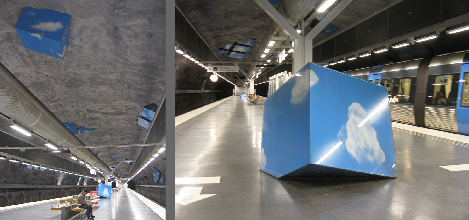
Upstairs, outside at the door to the subway
station, a solitary cube of grey subway tunnel pushes up through the sidewalk. The cubes of sky inside the tunnel are great,
but somehow, it’s this one grey cube of tunnel that makes the installation
truly awesome and amusing.

A close second favorite subway art installation is the
pulsatingly red tunnels of Solna Centrum.
Descending the shaft on the l-o-n-g escalators almost looks like
descending through a birth canal.
Downstairs, on the platforms, the pulsating red tunnel gives way to a
kelly-green horizon with spruce trees in silhouette.
The glaring red makes the tunnel feel bright, even though it is dimly
lit. As the red meets the green horizon,
the red reads as the most glorious sunset ever imagined.

Each station also has a very helpful compass on the
floor. Because most stations have two or
more exits from the platforms, the compass helps you to know which exit you
want, even if you don’t remember the exact name of the street on the exit signs. I find the compass extremely helpful
in such a disorienting environment—well underground with no daylight or
landmarks to guide me.

FRIDAY, SEPTEMBER 16, 2011
Spånga Church
So
Carl and I are currently living waaaayyyy out in the suburbs of
Stockholm. Historically, the area was a farming community, and the
built evidence of that community goes way back, even farther than the
founding of Stockholm. Built sometime between 1175-1200, the Spånga
Kyrka is one of three churches in the Stockholm area to survive more
than 825 years of development. Like most of Sweden’s churches from the
period, Spånga church was as much a place of refuge from invasion as it
was a place of worship of god.
 | |
| the nave and tower are original |
Windows
along the nave were not added until the 1300’s, but they were only
added on the south side of the church, protecting the north facade from
arctic winter winds.
The
simplicity of the smooth plaster exterior gives no hint of the richness
of the interior of the church with its rib vaults and 15th century
frescoes. You could do a dissertation on all the St. Georges slaying
Dragons in Swedish churches.


There
is also a 17th century chapel appended to the nave beyond the alter.
Designed by the prominent architect Nicholas Tessin the Elder, this
baroque chapel contains eight angels bringing the keys of heaven down to
the Bonde family, who are buried here.


But
my favorite part of the church were the Rune stones. I have probably
seen more than 50 rune stones during my visits to Sweden, but I am still
not over them. They are just so cool, so old, so...foreign! They
bring to mind wandering Vikings and tragic Norse mythology. Rune stones
in Sweden date back to 400 or 500 AD, and the Runic alphabet is
distantly related to Greek. Apparently Romans brought the Greek
alphabet to Germany, or German mercenary soldiers brought the alphabet
northward when they returned home. As the alphabet moved further north
into Scandinavia, it became distorted until it became the Runic alphabet
used by Vikings in Sweden.
Christianity came relatively late to Sweden. The first missionary didn’t visit this far north until the 800’s and it wasn’t until the late 11th century that most vikings converted for opportunistic reasons. With Christianity came the Latin alphabet, and the last runestones were carved in the 12th century.
 |
| runestone fragment incorporated into church structure |

This site have particular software articles which emits an impression of being a significant and significant for you individual, able software installation.This is the spot you can get helps for any software installation, usage and cracked.
ReplyDeleteKlevgrand Complete Bundle Crack Free.
klevgrand-complete-bundle-crack
Pretty great post. I simply stumbled upon your blog and wanted to mention that I have really loved surfing around your blog posts. Great set of tips from the master himself. Excellent ideas. Thanks for Awesome tips Keep it
ReplyDeleteklevgrand-complete-bundle-license key download